News - Branding
Canada Unveils New Tourism Identity
June 1, 2019
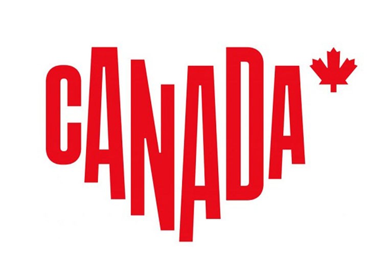

The new red and white logo stretches the word ‘CANADA’ to form a typographic heart. The country's national symbol, the maple leaf, is also strikingly presented next to the wordmark. The new tagline, ‘For Glowing Hearts’, is inspired by Canada’s national anthem, O Canada.
The new logo is a pleasant change to Canada’s previous text-based wordmark that has been described as pretty standard and dull.
The overhaul, however, is generating mixed responses, mainly because it is said to be reminiscent of the famous I heart NY by Milton Glaser. Yet the shape is a little wide and might not be apparent as a heart at first glance because it is unevenly-stretched.
The redesigned identity also arrives with a brand booklet describing the logo as "a reflection of Canada today, a study in movement and evolution rooted in our country's bold colour and iconography. Here, we take the nation's pulse and feel its heartbeat. It's an embodiment of the positive energy that makes hearts glow."
It contains additional information on how to present the logo properly, as well as displays more definitions of how Canada wishes to portray itself to the world. Photographs of the beautiful country are also found inside it, including double-page spreads all rendered in Destination Canada's display font ‘Separat Black’.
All in all, the new identity is fun and quirky and not really the sort of brand identity you'd expect from Canada. Yet, this is a brilliantly fresh and unexpected piece of branding.
The country’s tourism marketing agency says the update of its brand has been designed to create a “strong emotional connection with travellers” and inspire more people to visit Canada.


.jpg)