Art & Design
Quarantining on Disconnected Arabic Fonts: Kameel Hawa’s new take at the art of shaping Arabic letters
by Ahmad Osman
January 26, 2021
.jpg) Advertisement
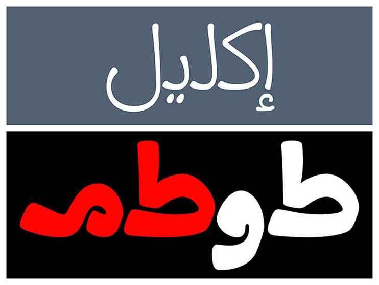
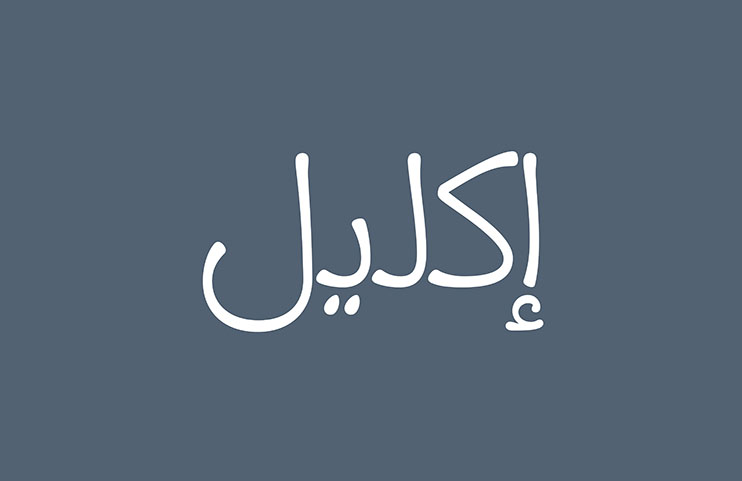
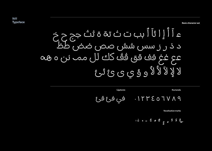
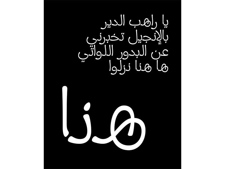
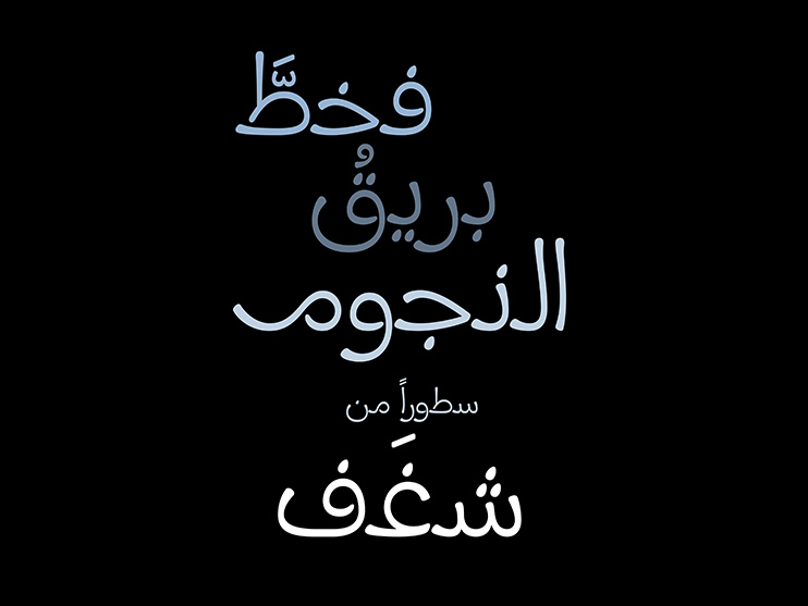
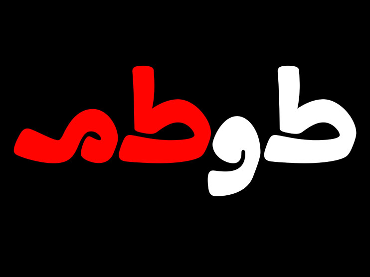
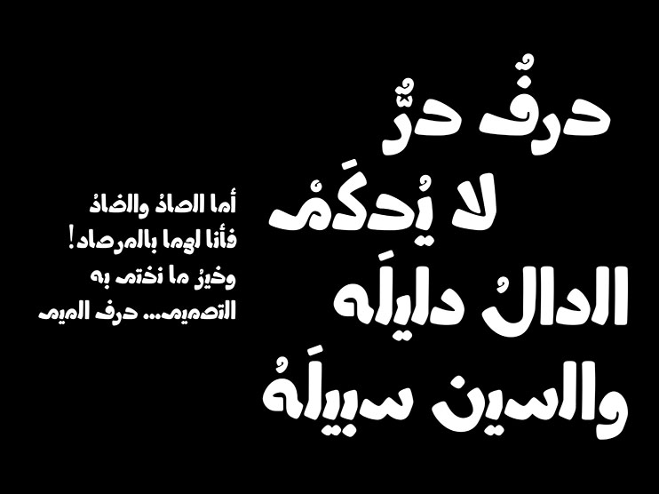
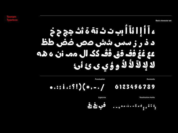
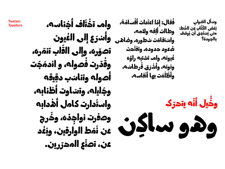
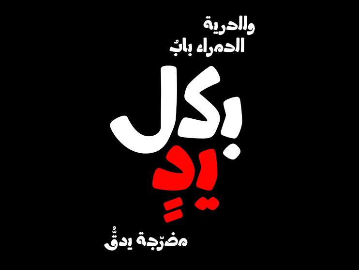
AdvertisementThe names of the fonts in question, “Iklil” and “Tawtam” respectively, serve as the reader’s first hints to their starkly different aesthetics; whereas “Iklil” (Arabic for “floral crown”) has a lace-like presence with its thin, intricate letterforms; “Tawtam” (Arabic for “Totem”) is thick, bulky, and tribal.
Both fonts belong to the Display category, namely, fonts that are best suitable for use in larger setting for titling or callout contexts – as opposed to Text fonts, which are set in smaller size for body text.
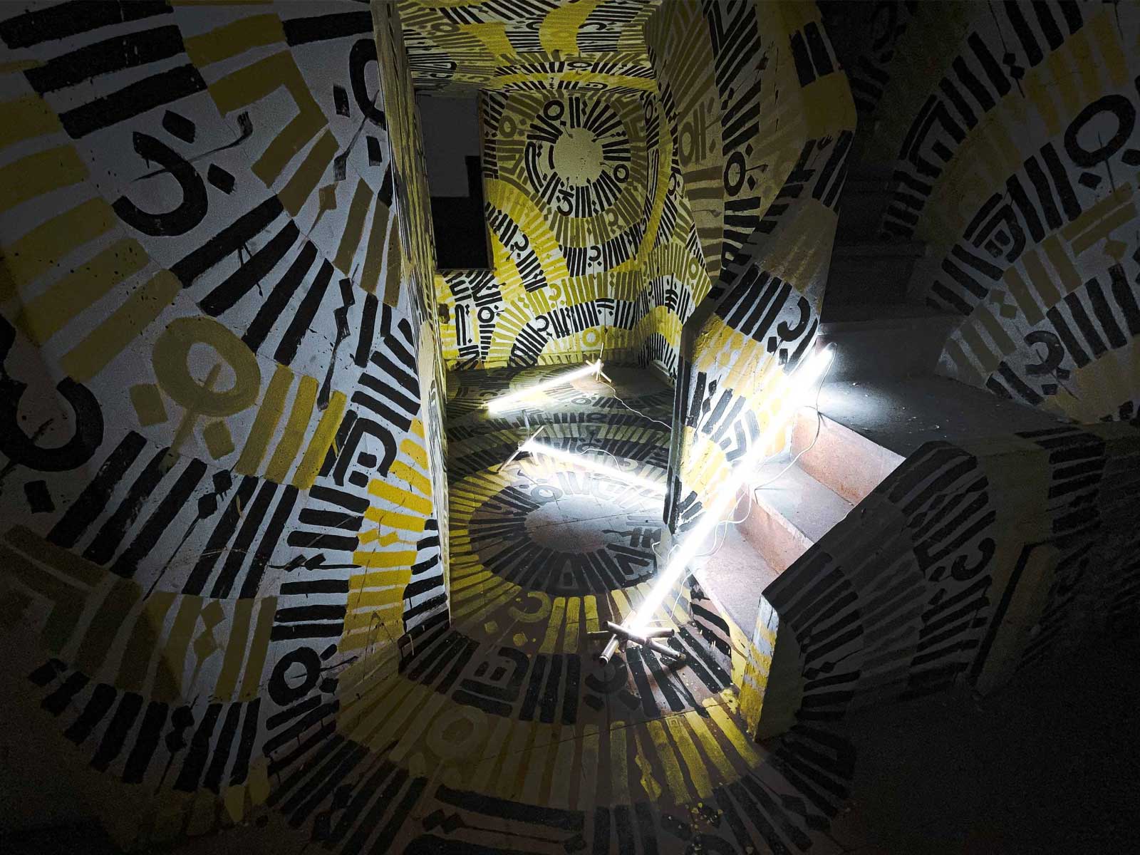
As mentioned, the two fonts are disconnected, which is to say that unlike most Arabic fonts, their letters do not connect to each other but are free-standing instead. Evidently, this is a feature that those fonts share with most of their Latin counterparts, although the objective here is not to look Latin but rather to deconstruct the reading experience and celebrate letterform in its integrality.
Hawa is not alone in this endeavour but shares it with contemporaries such as Yara Khoury and Kristyan Sarkis; and way before that Nasri Khattár, a Lebanese visionary who was the first pioneer of this idea, and who pursued it as a project over a span of four decades starting the 1940s.
Nor is this Hawa’s first experiment in designing disconnected Arabic fonts, for in 2016, he designed a font called “Tashkeel” (“Composition”) that was disconnected and that even restricted itself to the Latin maxim of one letterform per letter – the same maxim that Khattár deployed in his work in the 1950s and 1960s.
In comparison, Iklil and Tawtam come across as more reconciled with mainstream Arabic fonts; whilst they do not revert to having four letterforms per letter by position (free-standing, initial, medial, and final), they consolidate these positions into two sets, namely free-standing-final & initial-medial.
As a result, Iklil and Tawtam might have higher legibility than Tashkeel and can therefore be used for longer spans of text.
When interviewed about his recent fonts, Hawa notes that they are the fruit of his quarantine, describing his creative process to be one of “designing fonts for design’s sake”. Indeed, he says, the idea of disconnected fonts comes to emphasise the aesthetics of their letterforms rather than their actual functions – although in function they could probably play unique roles, given how characterful they are.
He states that for him, the art of shaping Arabic letters is genuine and serves as a candid reflection of what he is trying to do because in a way, he was a pioneer in drawing Arabic letters without depending on traditional Arabic calligraphy or the calligrapher’s reed so to speak, but rather designing the letterform out of sheer formalistic experimentation – the way a designer would design a chair or a teapot. This idea is particularly salient in the shape of the letters Sád and Dád in Tashkeel, which have a stark Art déco look to them.
Anyone who is acquainted with Hawa would understand the extent to which he has practiced inquisitive formalism throughout much of his productive life as painter, designer, and writer; something that has impressed his corpus with an air of playfulness that borders on cynicism, and that is explained in greater depth in a recent book on him, The Art of Shaping Arabic Letters, by Huda Smitshuijzen Abifarès of as a Khatt Books publication (Arabic Design Library) that was intended for launch last year.
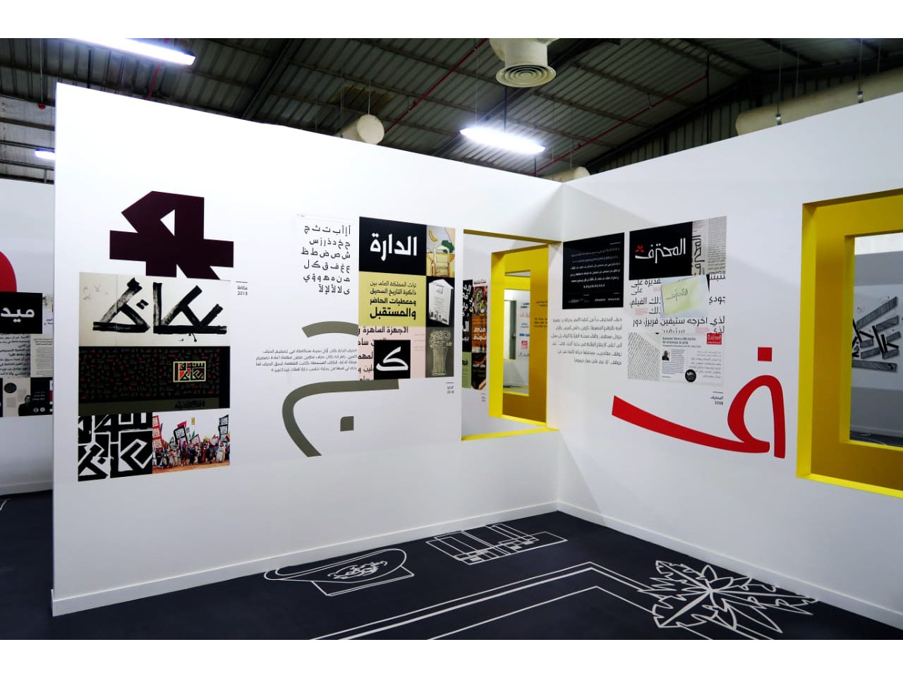
Worth noting is that Hawa whose name was for many years associated with Mohtaraf Design House that he founded three decades ago, has twice received the TDC (Type Directors Club) Award; once for Midan font, and once for Al Mohtaraf font, a font that is a purely a designer’s expression, and that relates to the movement of the hand, rather than to classical calligraphy.


.jpg)
.jpg)
