News - Branding
Pepsico hits refresh with a logo — and mindset — built for the future
by Gaya Salam
November 4, 2025

.jpg) Advertisement
Advertisement
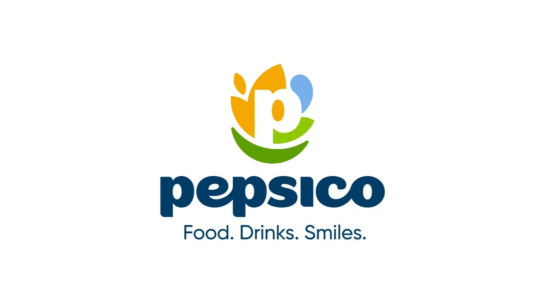
PepsiCo has rolled out a bold new corporate identity — its first major rebrand in nearly a quarter of a century — signaling a strategic evolution from beverage titan to a diversified global food and drinks group.
.jpg)
According to the company, the changes are intended to align more closely with PepsiCo’s current positioning and its broader consumer and sustainability strategies.
Gone is the familiar red, white, and blue globe. In its place: a white lowercase “p” framed by abstract shapes that symbolize different aspects of PepsiCo’s business, mainly their three key pillars: food and grains (brown), drinks and water (blue), and sustainability (a green leaf that forms a smile).
The visual cue neatly ties into the company’s new tagline, “Food. Drinks. Smiles.”, underscoring a purpose that extends beyond soda.
The rebrand, developed with Portland-based agency Studio Mega and PepsiCo’s in-house design team, introduces a custom sans-serif typeface of rounded lowercase letters for a friendlier, more human tone. The color palette, too, breaks from the dominance of Pepsi blue, embracing earthy and natural hues that mirror the company’s sustainability and wellbeing agenda.
“Our new identity boldly reflects who we are in 2025 — a company with expansive reach and an unmatched family of beloved food and drink brands,” said Ramon Laguarta, PepsiCo Chairman and CEO.
Founded 60 years ago through the merger of Pepsi and Lay’s, the company’s 500-plus brand portfolio now spans household names like Gatorade, Quaker, Tostitos, and Siete — supported by over 300,000 employees worldwide.
The rollout of this new identity will be gradual, appearing across digital platforms, packaging, workplaces, and signage beginning around 2026.
“Our refreshed corporate brand is a beautiful expression of both who we are as a company today and our aspiration for the future — reflecting our wide portfolio of beloved foods and drinks brands,” said Jane Wakely, Chief Consumer and Marketing Officer and Chief Growth Officer, International Foods. “By putting smiles at the heart of our visual identity, we’re signaling our obsession with consumers, and that obsession fuels our growth.”
The company wants to present itself as a multifaceted global food and beverage company with positive impact goals, rather than being defined merely by the Pepsi soda brand.
With this identity reset, PepsiCo finally bridges the gap between its corporate purpose and its product reality. The lowercase “p” may look simple, but it carries serious intent, signaling warmth, inclusivity, and the confidence of a brand that no longer needs to shout to be seen.