News - Branding
General Motors revamps logo to mark drive towards 'all-electric future'
by ArabAd's staff
January 10, 2021
.jpg) Advertisement
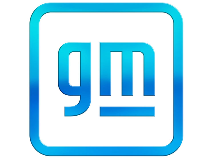
AdvertisementThe rebrand swaps out the old logo's dark blue background with its white lettered uppercase monogram for a light blue lowercase 'gm' with a gradient, which sits in a white box outlined by the same light blue.
Designed by GM designers, the new mark has rounded edges, with the all-caps acronym that has featured in the General Motors logo since 1938 has been lowercased, with the negative space around the 'm' suggesting the shape of an electrical plug.
Its navy backdrop has been replaced by a rounded, bright blue gradient border to evoke "the clear skies of a zero-emissions future," General Motors said.
Paying respect to the "history and trust" inherent in this original design, the new logo retains most of its core elements, including the bold stroke that now underlines only the m.
The resulting design is made for digital environments, rather than being featured on the company's actual cars. It will be debuted in an advertising campaign called Everybody In, which aims to challenge stereotypes about the kind of person who drives an EV.
The design marks a considerable change for GM. "GM has the talent, technology and ambition to advance a safer world for all, help reduce emissions and accelerate toward our all-electric future," said GM's global chief marketing officer Deborah Wahl.
GM plans to launch a total of 30 different Electric Vehicles (EV) models globally by 2025. Similarly, the automaker's set a goal of selling more than one million EVs per year in North America and China by the middle of the decade.
GM's latest logo marks only the fifth significant change to the company's insignia throughout its 113-year history. The last time the automaker drastically updated its logo was in 1964.
As GM embarks on a radical transformation into an electric vehicle manufacturer, it does seem fitting that the company take on a new look.



.jpg)

