News - Branding
McDonald's packaging receives a new playful design makeover
by ArabAd's staff
February 17, 2021


.jpg) Advertisement
Advertisement.jpg)
Burger King announced a rebrand earlier this year. Now it's McDonald's turn!
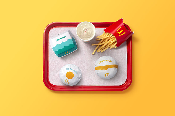
This packaging makeover is, unsurprisingly, filled with flat design. It is bold and illustration-led with bright graphics and prominent typography. The new look sees the entire packaging receive a playful makeover that is designed to bring "a sense of joy and ease" to the brand. It looks fun, celebratory with a pleasing retro feel that is emphasised by the clean, sans-serif typeface.
"We pulled out the most delicious and iconic aspects of each menu item to redesign their entire packaging system from top to bottom," says Pearlfisher, the independent creative agency behind the work. "Bringing personality to life through simple illustration allows for the packaging to be functionally unique, easy to identify, aesthetically minimal and, most importantly, emotionally joyful."
As part of an overhaul of the beloved arches’ multi-year redesign, the agency oversaw the implementation of the new graphics system, what they’re calling the “single visual framework for the brand’s portfolio of products.”
With over 60 million touchpoints being used every day, packaging matters, and Pearlfisher decided to opt for a prominent on-pack messaging in the new branding.
The famous iconic menu is now housed in the new boxes, sleeves, wrappers, and cups.
The classic red french fry sleeve has only received subtle modifications and saw the inner pinstripes get replaced with thick yellow stripes. Egg McMuffin wrappers are especially whimsical, with a yellow yolk sitting in the middle of the all-white wrapper. Quarter Pounder and Big Mac boxes depict layered graphic representations of the signature burgers along with oozing cheese. Fillet-O-Fish containers take a different approach—instead of a fried fish patty, two-toned ocean waves adorn the outside.
The new packaging ensures that employees will be able to easily identify the content of the packaging so that operations may run efficiently, regardless of the country you’re ordering it in.
“These easy-to-understand graphics drive recognition regardless of where in the world orders are being assembled, shared, and enjoyed,” said Matt Sia, creative director at Pearlfisher. “Our task was finding out what was special about each menu item to design a system that would make it easy for others to do the same.”
“There’s beauty in the simplicity of McDonald’s iconic menu items. We aimed to find the most special, recognizable, and iconic expressions of each—celebrating them in a way that makes people smile,” Sia continued.
The new system will be rolled out globally as part of an effort to create a single and cohesive identity in every market McDonald’s operates in.