News - Branding
Mirinda’s new visual identity designed to attract Gen-Z
May 10, 2023


.jpg) Advertisement
Advertisement.jpg)
Mirinda has revealed its new global brand platform, ‘There’s no flavour like your flavour’, alongside a playful new visual identity system, in a bid to appeal to Generation Z audiences.
Placing boldness at the forefront of Mirinda’s ‘M’pactful new look, the fruit flavoured carbonated soft drink brand aims to provide the much-needed spark of inspiration that Gen Z is craving.
Creative agency Buck and brand design agency Bulletproof have developed for Mirinda a colourful new identity called “Making an M-pact”, working with the PepsiCo Design and Innovation team and the creative duo Estudio Santa Rita on illustration.
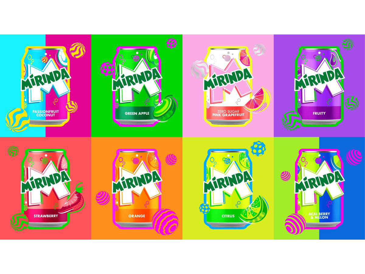
The first change among a slew of updates is to the logo, which has been given a brighter green, along with sharper corners and cleaner lines to ‘amplify its distinction’. A bold ‘M’ is placed front and centre across the new cans and serves as a canvas of creativity from which the brand is brought to life.
The new visual identity also features ‘playful colour palettes’, which aim to provide a ‘burst of refreshment’, while twirling spheres, fizzing bubbles and zesty fruit illustrations convey a sense of playfulness and energy throughout.
Each of the brand’s 50-plus fruit flavours were given a corresponding colour palette, each with their own contrasting colourways.
“We are pleased to unveil Mirinda’s new global brand platform that inspires vibrant creativity, encouraging Gen Z to harness their uniqueness as a superpower,” PepsiCo vice president of global brand marketing, Eric Melis, said. “Through #NoFlavourLikeYourFlavour we have developed a refreshing new visual identity and platform, which Mirinda fans can identify with – one that empowers this generation to resist conformity and instead, embrace self-expression.
“This marks the first step for the brand as we continue to evolve and grow in line with the youth of today. We look forward to rolling out the exciting plans we have in the pipeline.”
The new visual identity will be visible on all Mirinda cans, merchandise, advertisements, retail displays and digital media across its 200 markets.
PepsiCo senior vice president and chief design officer Mauro Porcini added: “Mirinda’s 50+ flavours are a treat for the senses, and we wanted the brand’s visual identity to look and feel the same. PepsiCo Design and Innovation brought Mirinda to life with vibrant, contrasting colours and bespoke illustrations that create a sense of dynamic energy and playfulness. We know Mirinda fans engage with the brand digitally as much as they do physically, so we created a visual identity that retains its excitement and distinction across all platforms.”
Mirinda’s new visual identity will be rolled out across the leading 20 international markets from May 2023, with many featuring their native languages on the cans. Kicking off with Vietnam and Thailand, the new visual identity will then appear in Poland, Romania, Czechia, Ukraine, Hungary, Croatia, Gaza/Palestine, Mexico, Argentina, Egypt, Iraq, Uganda, Ethiopia, China, Pakistan, Kuwait, Qatar, Oman, Bahrain, and the United Arab Emirates and much more to come.