News - Branding
Pfizer has a new visual identity
by ArabAd's staff
January 7, 2021
.jpg) Advertisement
AdvertisementPfizer has been changing a lot in the last few years. After more than 170 years of preventing and curing disease, Pfizer has arrived at a new era – "a time of extraordinary focus on our science and the value it brings to patients," reads a press statement.
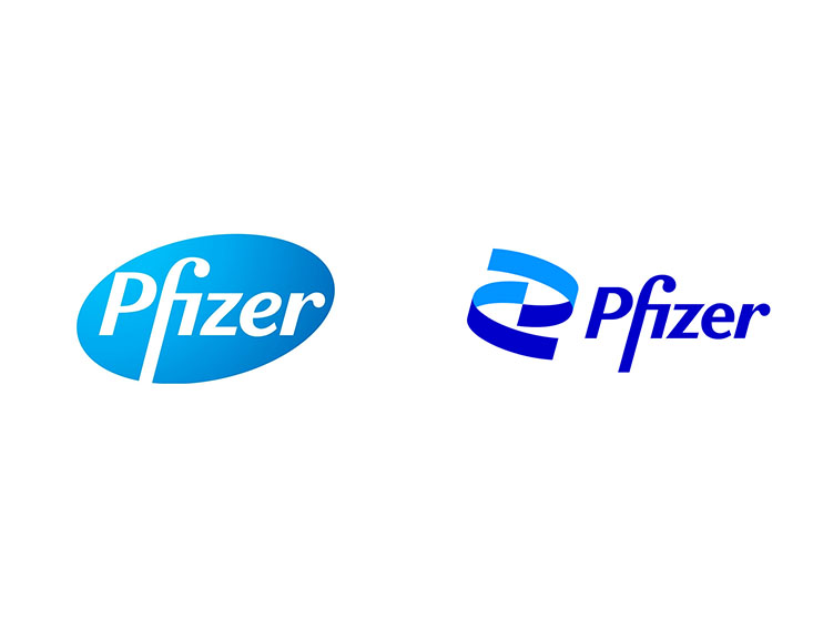
The logo – which retains the company’s traditional blue colour scheme – has been more than 18 months in the making and according to the company it is “unlocking the pill to reveal Pfizer’s DNA: the power of science.”
By uniting transformational technology, cutting-edge science and indomitable human spirit, Pfizer is pioneering biopharmaceutical innovations to do more than just treat difficult diseases – they are curing and preventing them.
The logo also “signals [a] shift from commerce to science”, according to an explanation on Pfizer’s website, but retains the same tagline as its predecessor: “Breakthroughs that change patients’ lives.”
They’ve also unlocked the pill form to reveal the core of what they do: a double helix, spiraling upward.
Therefore, 2021 marks the advent of the new Pfizer – the culmination of a bold, decade-long transformation from a scientific fast follower to what it aims to be--a first-in-class scientific powerhouse; from a diversified enterprise to a more focused and innovative biopharma company.
Encoded within a successful emblem is a company’s DNA – its history, its future. Pfizer’s new corporate brand identity is a digital-first expression of the company's commitment to the transformative power of science and a dynamic reflection of its new stated purpose.
Moreover, Pfizer surveyed more than 4,000 patients and 2,000 doctors across multiple countries, and held 12 internal focus groups, before deciding on the new design.


.jpg)


