News - Branding
Starbucks' Ready-to-Drink portfolio gets a refreshed design and new uplifting brand campaign by Landor & Fitch
November 17, 2022
.jpg) Advertisement
AdvertisementStarbucks, the renowned roaster and retailer of speciality coffee in the world, debuted a new look for its EMEA ready-to-drink portfolio in partnership with global brand transformation company Landor & Fitch following a two-year creative collaboration.
Starbucks identified an opportunity based on consumer insights, which revealed the importance of small transitional moments throughout the day, with time-poor consumers looking for an uplift to keep them going.
From this, the brand set out to redefine the chilled coffee category it had originally helped create over 10 years ago and reassert its leading position with a refreshed design and a new uplifting brand campaign.
Landor & Fitch’s Insights & Analytics team analysed key drivers of brand equity growth and purchase intent using a sample of 2,500 ready-to-drink consumers across EMEA. The research empowered the new identity and campaign, which both celebrate the ‘in-between moments’ during a typical day, in line with the core brand promise to ‘uplift the everyday’.
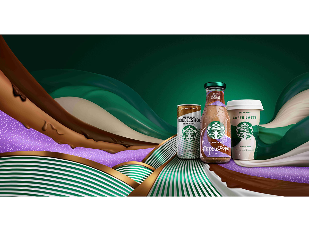
From architecture to packaging, the redesign celebrates simplicity and vibrancy through the magnification of the Starbucks iconic brand assets.
Moving away from the previous educational designs used to launch the category back in 2010, the fresh colourway utilises the classic Starbucks green to help deliver on the brand block ambition alongside existing flavour colour codes, to help build strong variation in the portfolio.
Wider changes were also made to enhance the Starbucks brand across the range; swapping the Frappuccino bottle lids from gold to green and showcasing the iconic Siren who acts as a catalyst for change. The new uplifting expressions coming out of the Siren clearly identify and depict each product in a unique way, using bold coloured textures and movements to convey the different flavours and benefits for each chilled coffee drink.
By confidently owning Starbucks assets, the new designs bring emotion to the range and tell the stories in a way which avoids category conventions, such as beige colourways and coffee bean imagery.
As part of its 360 approach, Landor & Fitch also led the creative direction for the multi-platform campaign, from conception to completion.
The objective was to increase Starbucks chilled coffee relevance through a stronger emotional connection with consumers and to reinforce each product’s distinct benefits.
The campaign seeks to demonstrate how Starbucks chilled coffees can transform a consumer’s day once they’ve taken a sip; with bursts of the new colourway connecting each consumer to their drink. Production was a WPP collaboration with Hogarth, supported by besweet.
The relaunch went live across the EMEA region* in Spring 2022; the out-of-home campaign, TV advert, social videos and in-store POS launched in June 2022. The TV spot aired on Channel 4, scoring above 90% for both short- and long-term effectiveness among the key target audience group (Kantar LINK test**). In its first month, 80% of viewers were watching the advert in full on YouTube.
Ryan Shaw, Executive Creative Director at Landor & Fitch, said: “We were thrilled to be chosen as the trusted creative partner for Starbucks® chilled coffee. We upheld high standards at every step to ensure the relaunch’s 360-brand experience delivered on the original ambition, working in sync with the wonderful Starbucks team who encouraged us to push boundaries and be extraordinary. The power of creativity trumped the limitations of working remotely during the pandemic, demonstrating a new level of collaboration that can be achieved when teams are passionate about the work”.
Charlotta Oldham, Marketing Director, EMEA at Starbucks, adds: “After establishing the chilled coffee category over a decade ago, it was time to reassess our brand’s distinctiveness. Working closely with Landor & Fitch across the entire journey, we are delighted to launch the Starbucks Ready-to-Drink refresh and reassert our position as the leading brand of choice in the EMEA RTD category. We have taken bold ownership of the Starbucks green and showcased our Siren against the brilliant new coloured textures to forge a greater emotional connection with our customers”.


.jpg)
