News - Branding
GoDaddy Finds a New Voice
by ArabAd staff
January 15, 2020
.jpg) Advertisement
AdvertisementThe strategy was developed by Lippincott, a creative consultancy specializing in brand and innovation; the logo design was implemented by Koto Studio and the leadership direction and implementation was conducted in-house.
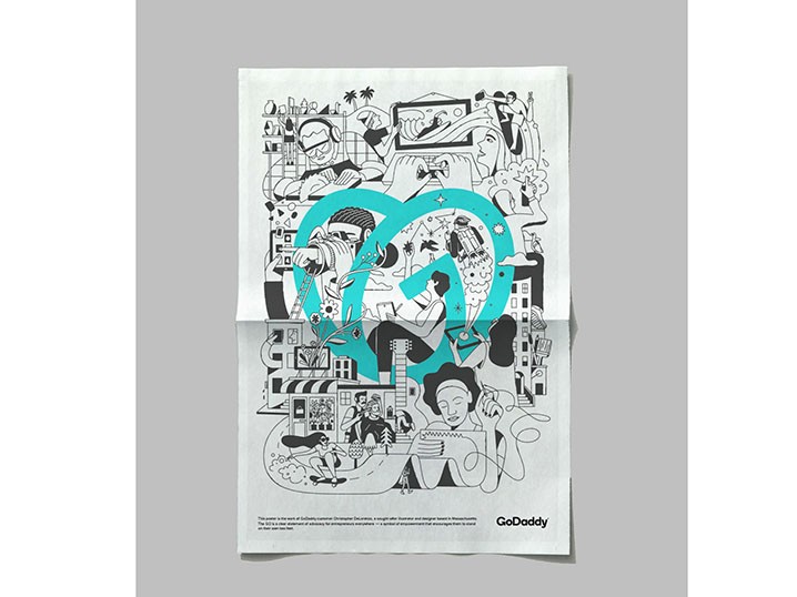
Next to the word GoDaddy, a heart with a twist that also forms the letter G has been added. The wordmark has been slimmed down in comparison to the old one. And the brand has moved away from its green color, to a new vibrant blue designed to speak the creativity of their customers.
Another big shift in the identity is the use of the bold, pointy, serif trend that has been widely adopted by editorial brands — Medium, The Guardian, BuzzFeed News, and others.
The new visual language has been build in a way that it can flex in different ways and styles. "We created the GO’s swooping arcs to represent the indomitable spirit of everyday entrepreneurs. And the word “go” itself is our rallying cry for folks to take the first or next step in their entrepreneurial journey," writes GoDaddy on their website.
With regard to the emotional and philosophical positioning behind the new identity, GoDaddy is trying to create "an inspiring world that sparks the possibilities our customers can create."
In 2018, GoDaddy started by dropping the guy icon, which has been around since the company’s inception, in 1997.
The new rebrand succeeds in giving the company a more professional and distinguished feel, while projecting a fresh modern voice.




.jpg)
