Creativity - Ads of the Week
Heinz Finds Its Logo Hiding in Every Fry Box
by Ghada Azzi
September 17, 2025
.jpg)
.png)
.png)
.jpg) Advertisement
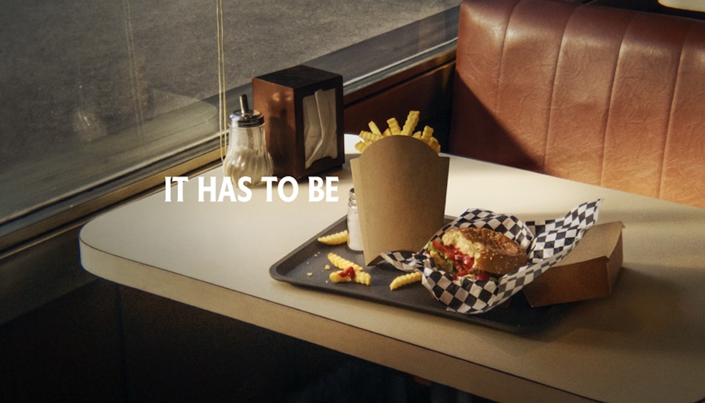
AdvertisementHeinz has long mastered the art of playful advertising. Its latest global campaign, “Looks Familiar,” takes another cheeky swing at creativity—this time revealing that fry boxes everywhere have been shaped like the brand’s iconic keystone all along. A simple truth, hidden in plain sight, turns into a big idea.
.jpg)
What do fries and ketchup have in common?
Beyond being a duo worshipped worldwide, Heinz is betting on a shared design cue: that humble fry box. Tilt it, squint a little, and you’ll see it—the same outline as Heinz’s unmistakable Keystone logo.
That’s the hook behind “Looks Familiar,” the condiment giant’s new integrated global campaign.
Why it works:
• Cultural truth: Fries are the most ordered food item globally on Uber Eats, and a fixture on more than half of restaurant menus. The appetite is there—Heinz just needs to secure its rightful seat at the table.
• Universal symbol: By pointing out that fry boxes have been “wearing” the Heinz keystone all along, the brand reframes a common shape into proof of their inseparability.
• Commerce play: In select markets, the campaign extends to Uber Eats promos, offering half off Heinz bottles—a smart link between brand storytelling and at-home consumption.
Nina Patel, Vice President of Global Heinz at the Kraft Heinz Company, summed it up: “Fries don’t just need any ketchup, they need Heinz.”
She added: "No matter where you are in the world, ‘Looks Familiar’ spotlights the truth that fry boxes everywhere are shaped just like our distinctive keystone."
And in her words, “In an unexpected and uniquely Heinz way, this campaign reaffirms the love that generations of Heinz fans have for the condiment in one of the most universal food occasions. While we don’t know who designed the first french fry box, it’s certain they must have been a big Heinz fan.”
Yet who knows? Maybe it was the other way around—perhaps the Heinz logo was inspired by the fry box itself. Either way, this pairing doesn’t feel accidental.
ArabAd‘s take:
Once again, Heinz proves that the best global ideas aren’t necessarily complicated—they’re obvious truths reframed with brutal simplicity.
Finding the Keystone in a fry box isn’t rocket science, but it’s exactly that kind of visual wit that keeps the brand’s creative voice sharp and universally relatable. And we at ArabAd are fond of such playful communication that triggers a smile in the mind.
Fries without Heinz? That’s like a logo without a brand and yes, with this campaign, we can safely say that Heinz has managed to claim the fry box.
Topics
Recommended

Dodge & Publicis Middle East Put “Cool Dads” in the Driver’s Seat
'Relax, it’s iPhone': Apple’s latest campaign brings Saudi soap opera drama to the forefront