News - Advertising
Ramadan Advertising: Mine Eyes Have Seen the Lantern, but not the Light
by Tarek Chemaly
June 10, 2016
.jpg) Advertisement
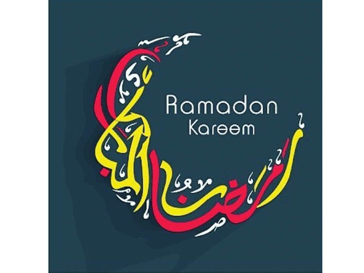
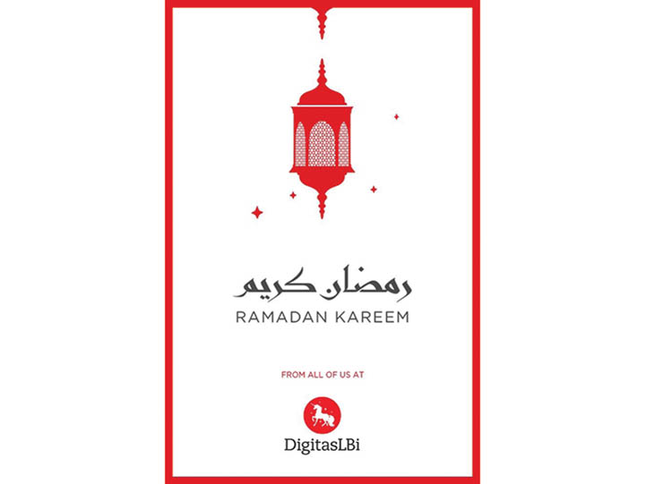
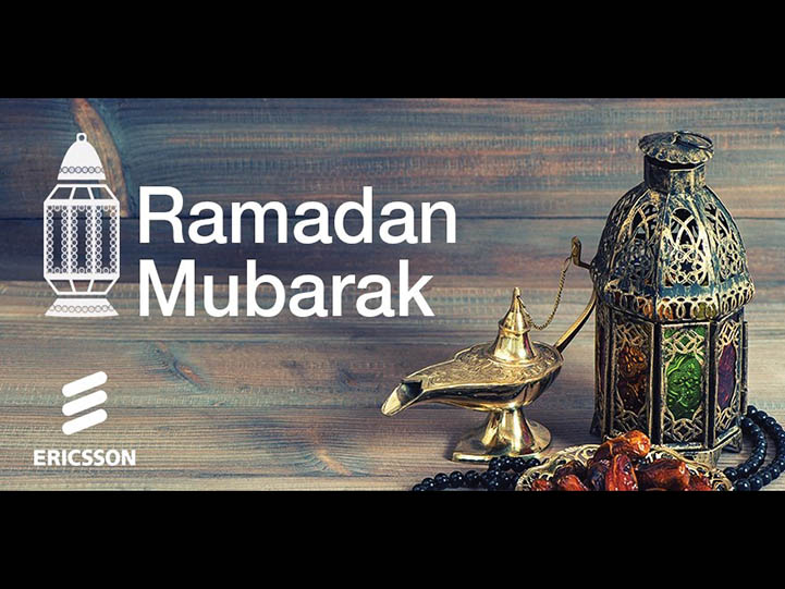
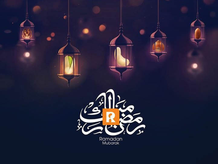
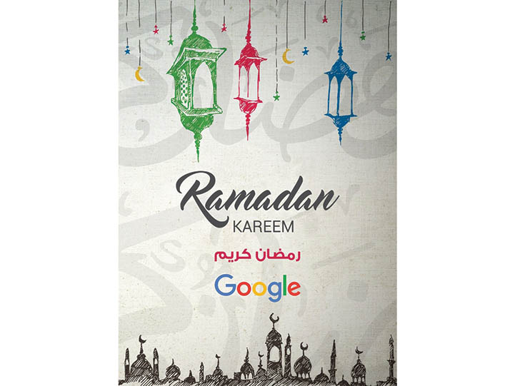
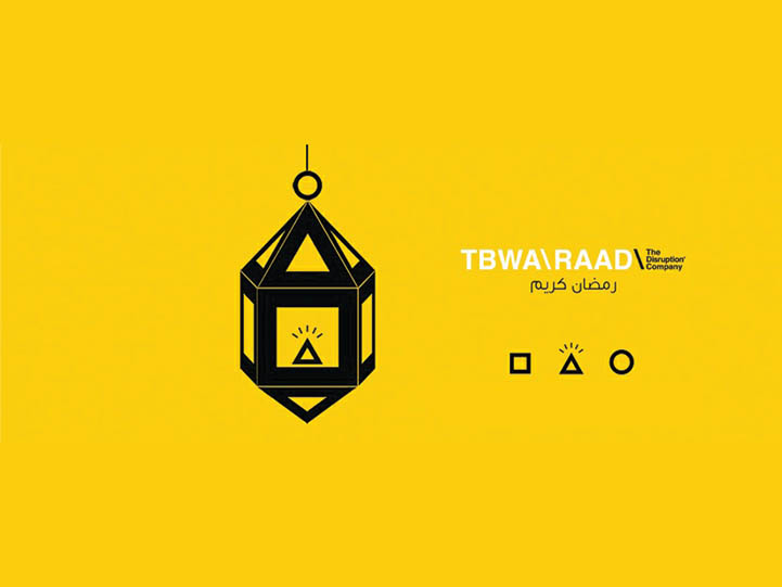
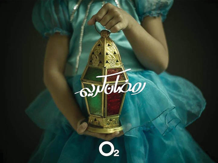
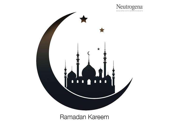
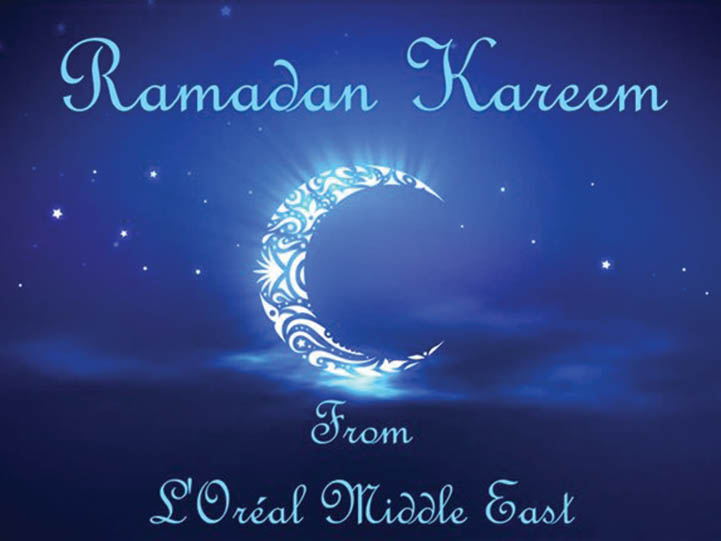
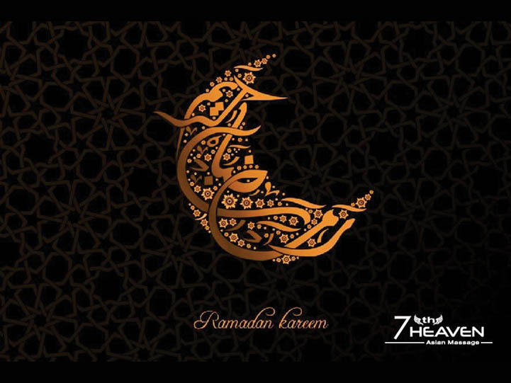
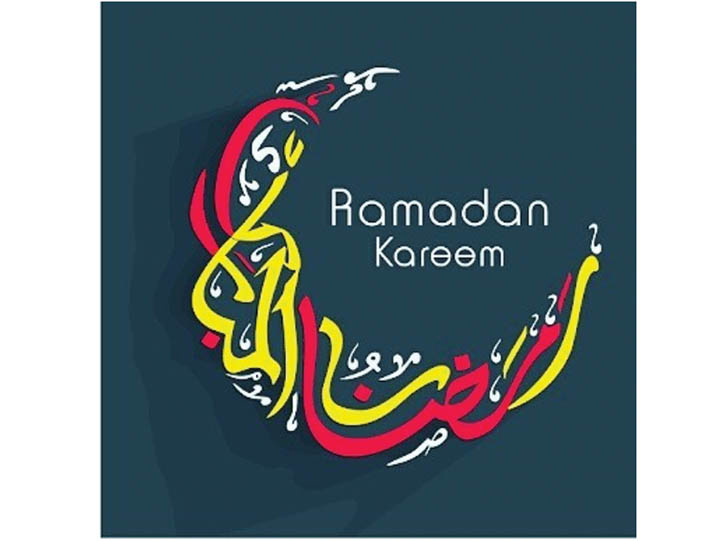
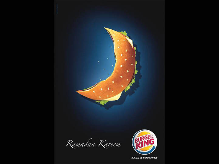
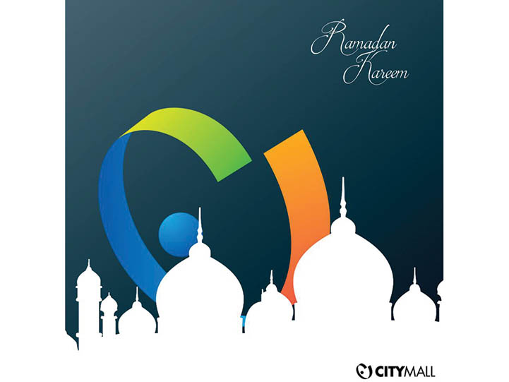
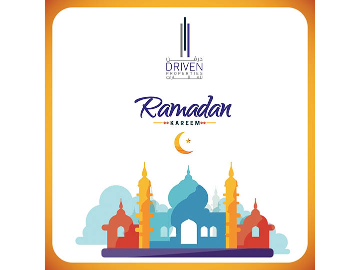
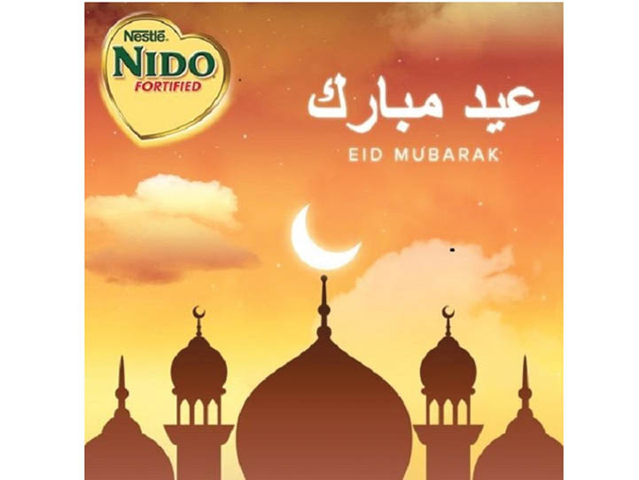
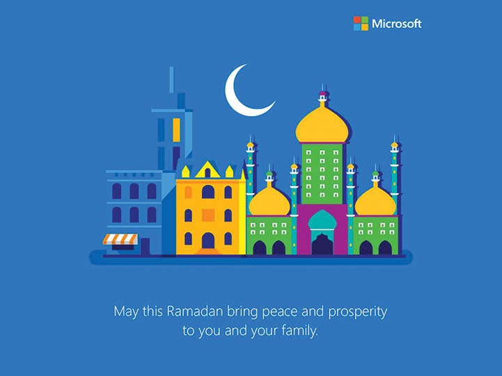
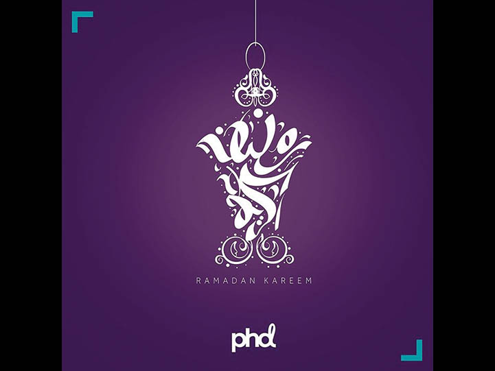
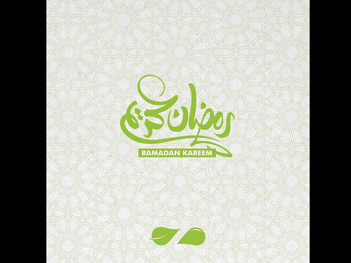
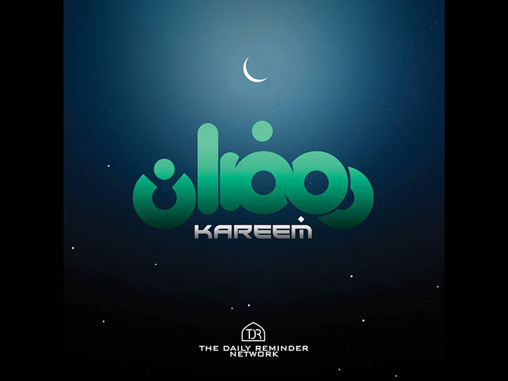
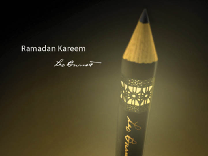
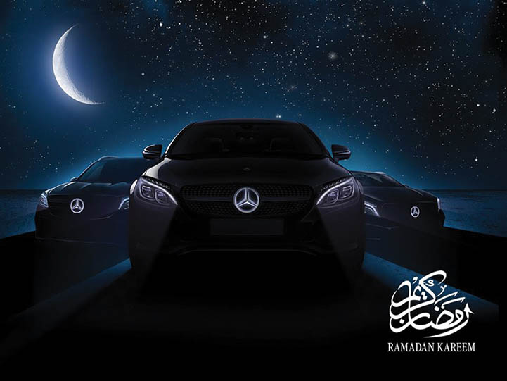
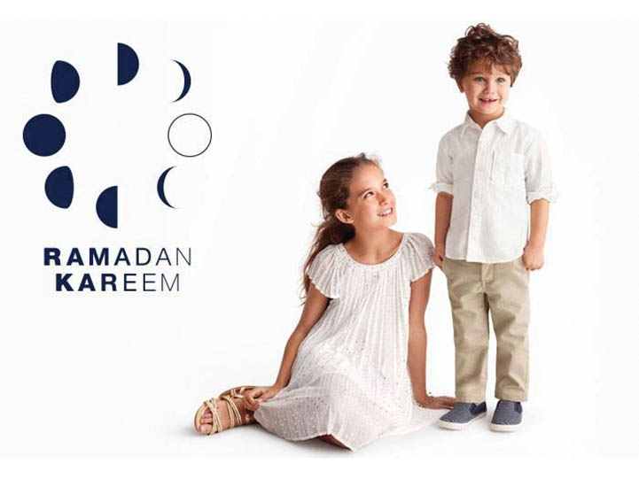
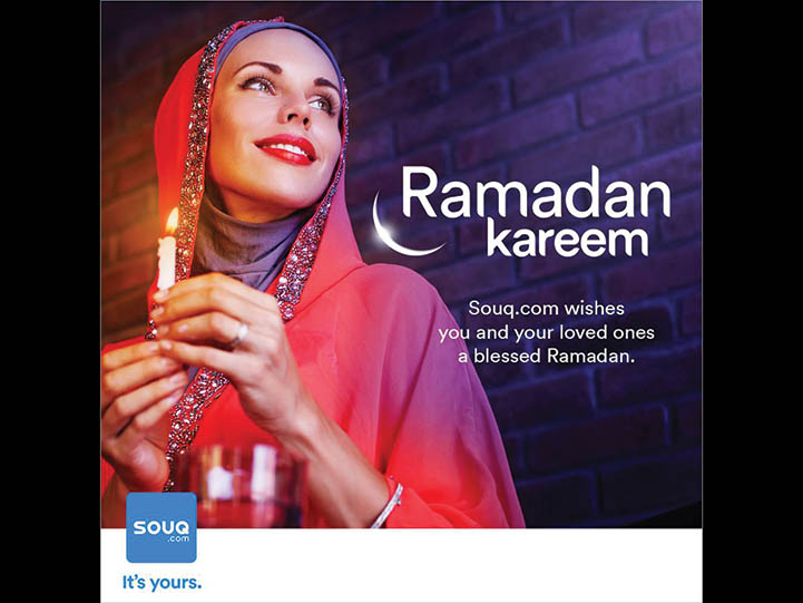
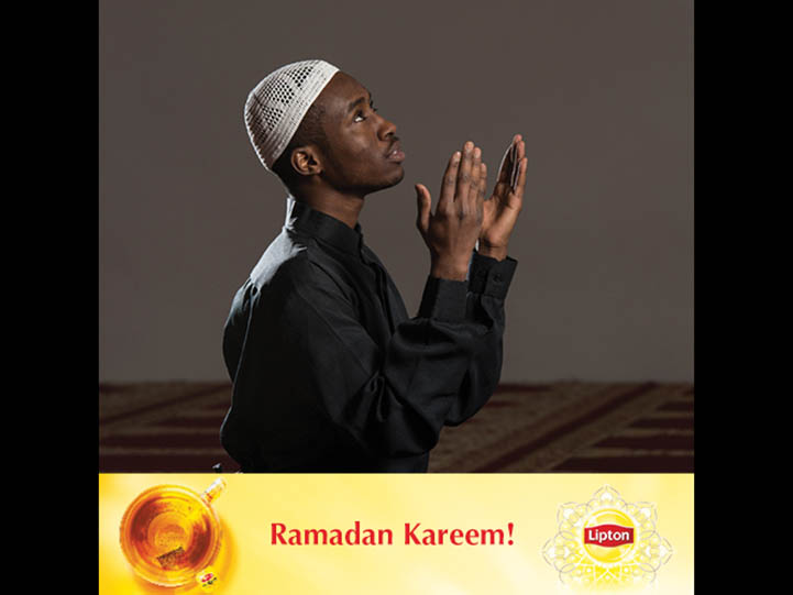
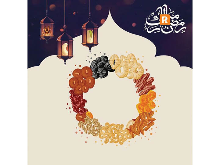
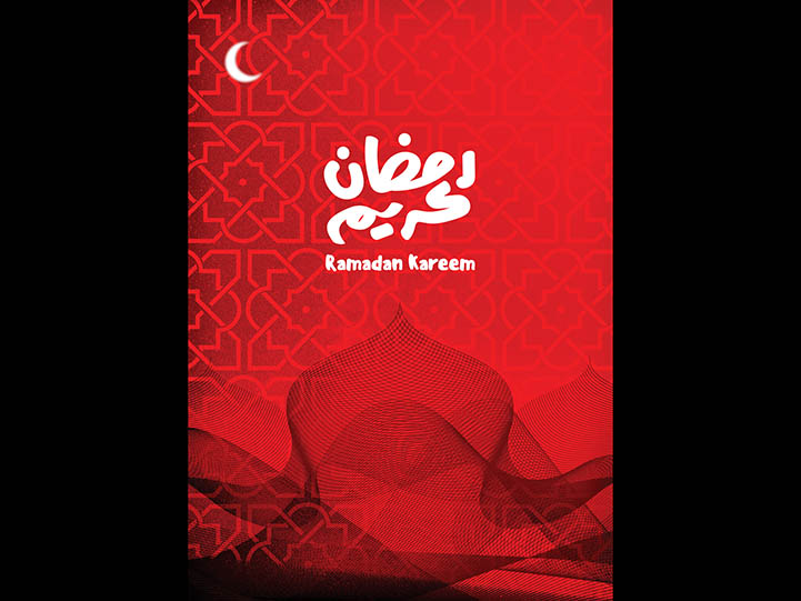
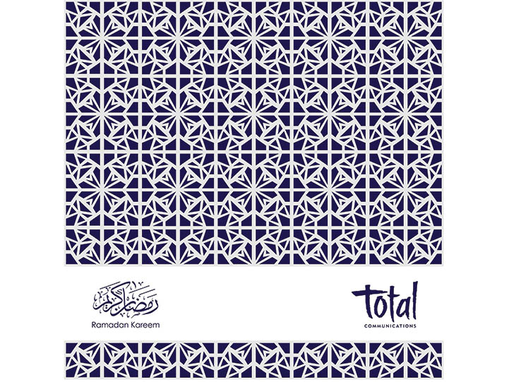
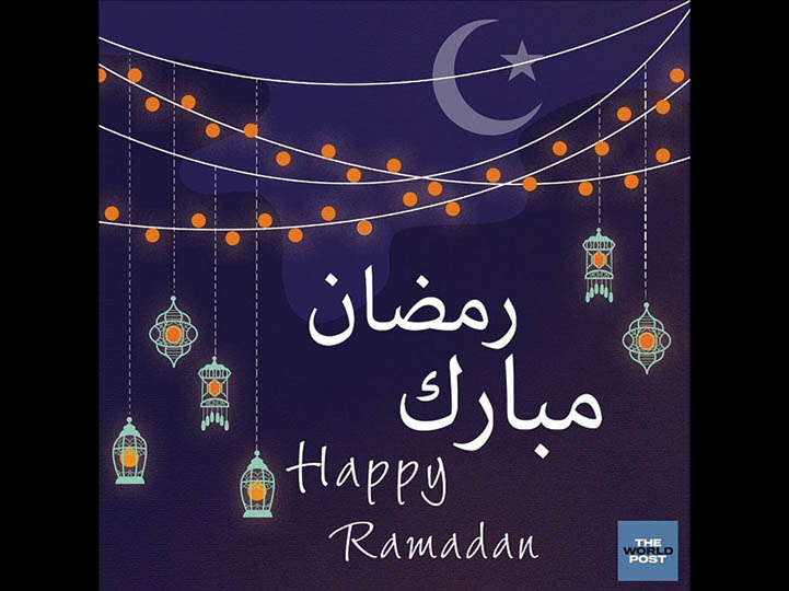
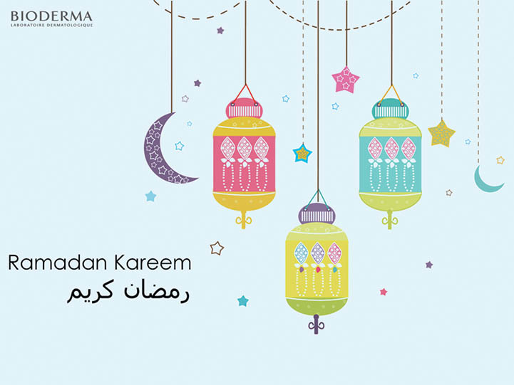
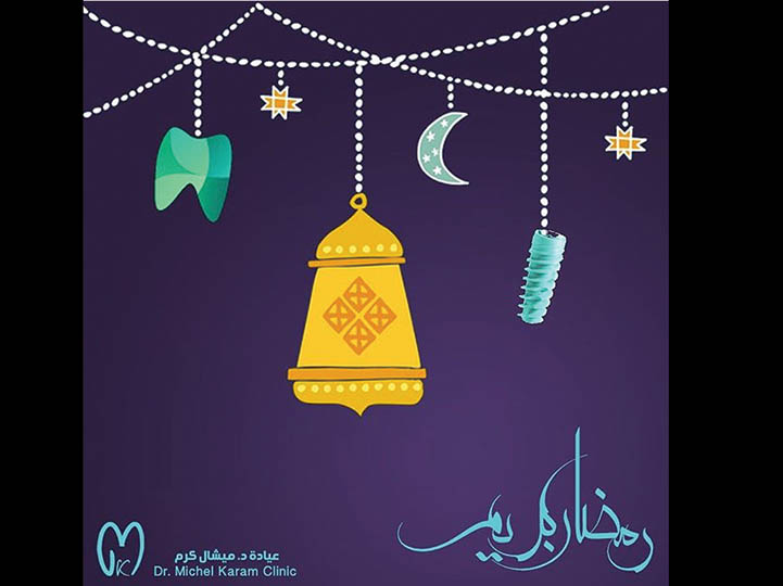
AdvertisementTo be honest, very few ads stand out, and in many ways, the logos of the brands are interchangeable. The colours are similar – they range from pistachio to dark navy blue, the typography – albeit for some few exceptions – is the rendition of what is thought to be liked by the target audience. The lanterns are all in motifs, with a cold digital light inside them. Naturally, the moon is there, for better or for worse, illuminating a contrasting background, which brings little or no warmth or intimacy.
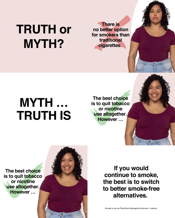
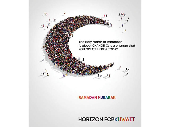
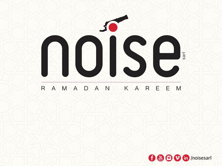
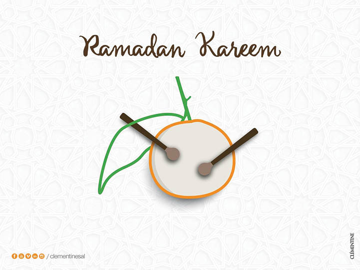
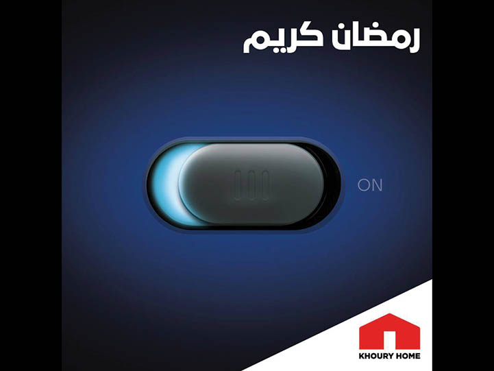
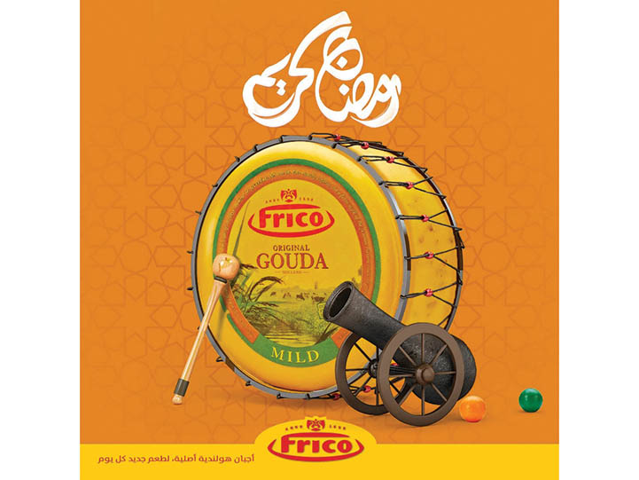
This is not to say the ads are “bad”, they are simply bland with no distinctive flavour. Very of few of them, if any at all, relate to the brands they are parading. There are some ads, which were smart enough to deal with the “usual” elements obliquely.One of the most difficult elements in a Ramadan ad is to incorporate one’s brand without having it get in the way of the occasion. Few manage to do it, yet advertising agency Clementine and sister PR company Noise stun in these Ramadan greetings - they really are creatively tailourmade for the brands. The French say "c'est compliqué de faire simple" (it is difficult to do something simple), but the French have not met the creatives who came up with this for the two companies.
But if we are to go back to the cards, be they digital or printed, which is the most ubiquitous mean of advertising during Ramadan, we cannot but somber into repetitive ideas.
One skims through them carelessly as they arrive in the mail, or in our feed – be it Facebook, Twitter or Instagram. Maybe we pay attention if there are offers, sales or discounts in tow. Creatively however, they are simple used, abused stale ideas, which come back every year. But the clients are happy and the creatives live with the hope of “maybe-next-year”.
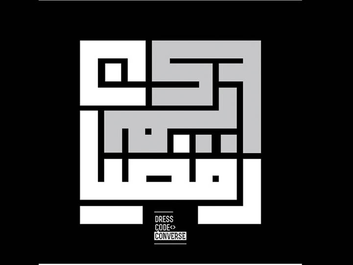
Till then, it will be lanterns, moons, Arabic typography and arabesque motifs.
This article was originally published in the July/August issue of ArabAd.


.jpg)
.jpg)
