News - Branding
Blink, a striking, bold and refreshingly quirky challenger bank
by Ghada Azzi
April 26, 2022
.jpg) Advertisement
AdvertisementMarking an exciting challenge for the Adpro Communications team, the first few weeks entailed assessing the market on the local, regional and global front, whereby the category and the brands were dissected, and debriefed. The team was aware that launching a successful new business requires complete clarity about what its value drivers are.
Following a marriage of traditional consumer research and a deep, real-time understanding of the behavior and pain points of individual customers, one concept came out as the clear winner: people want a bank that helps them live their life to the fullest instead of tying them and their money down, and from there the development kicked in.
From brand name to visual identity to color testing to DNA to communications, all teams were working in parallel to bring the brand to life within the challenging timeframe they had.
At the end of the project, the agency had developed a brand created by Jordanians that is of international standards, and a launch strategy that is thus far delivering impact on the business and brand front.
THE CORPORATE IDENTITY
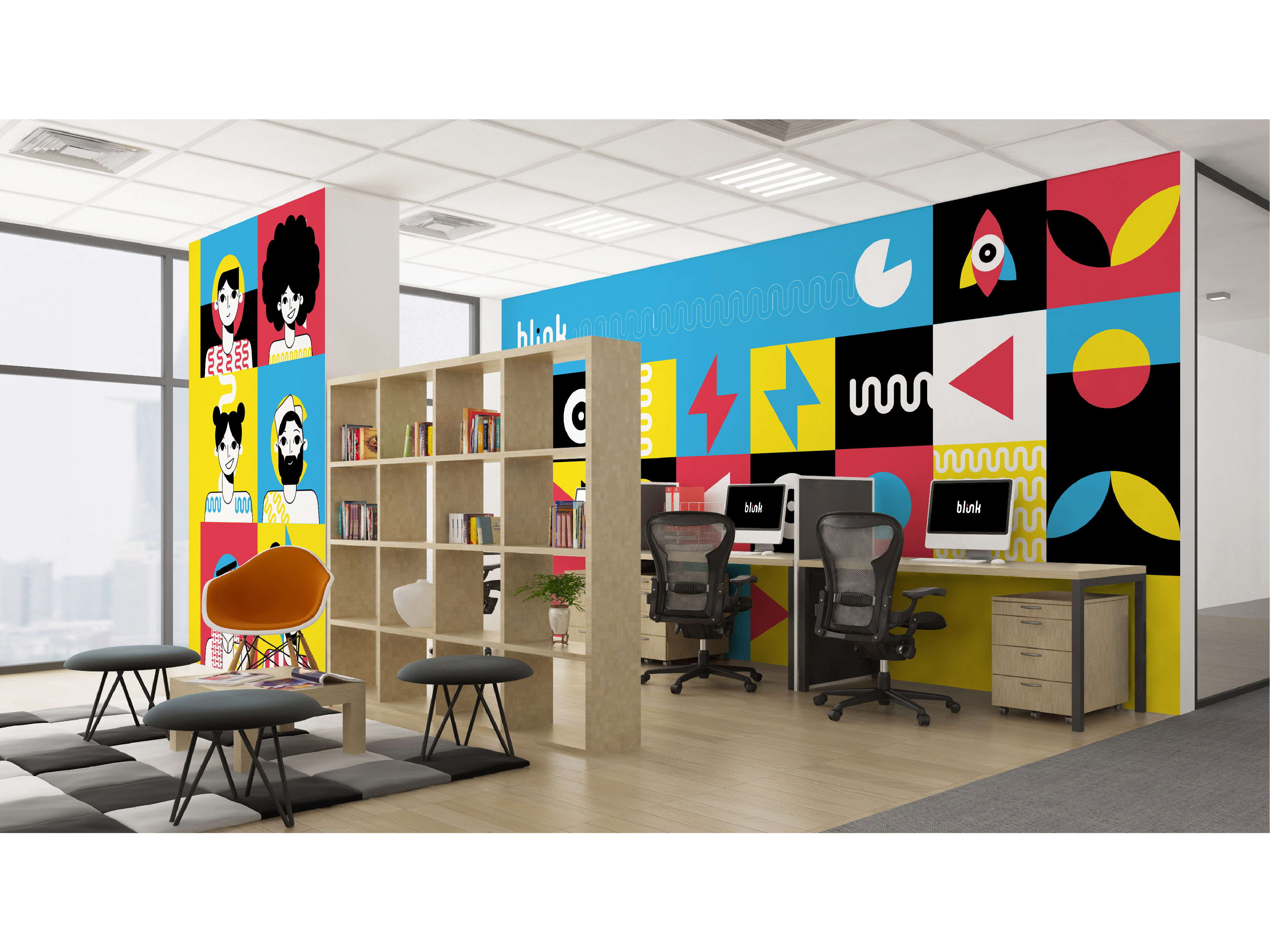
The new identity finally dropped across digital, social, and throughout an integrated campaign. Blink corporate brand identity is a digital-first expression of the bank’s commitment to the transformative power of digital. It’s a dynamic reflection of its purpose.
Blink was created to inspire a new and more liberated way of banking, one that enables customers to live with more.
Consumers today want to do business with financial institutions that are hip and innovative — banking providers that aren’t stuffy and traditional. Therefore, the creative team has created a refreshingly quirky and expressive visual identity to convince consumers that banking doesn’t have to be a boring chore.
The vibrant and contemporary tailored illustration style developed also help position the brand where it should be for its launch, attracting young audiences and digitally savvy customers to break free.
THE NAME
Blink is all about speed. Being the transformative brand it aims to be, the creative team wanted to come up with a name that represents that. And Blink seemed like an obvious choice. Blinking is an act of refreshment, it is a pause to see with clarity, and refocus on what matters, and for the challenger bank, that was life, because let's face we bank to live, we don't live to bank, and the core of this industry is to serve the people and not tie them down.
“Blink is a new breed of banking. It is everything a traditional bank isn't. Alive. Engaged. Understanding. Free. “
THE LOGO
With this in mind, the designers were able to come up with a modern logo, playfully bold and with a particular twist, as it stretches horizontally and seem to translate the idea of swiping, which is an element at the core of the brand.
Indeed, the entire experience is built around a language the youth is fluent with: swiping. So whether customers are looking to get more control, more freedom, or more reward, it is as easy as a swipe.
So it is no surprise to see it encoded within a successful emblem of the company’s DNA— an identity that is always in motion. Blink's visual identity is presented in a vivid, solid and hip color palette with four primary colors, which feel unique and modern: Rebellious Red, Yellow Sun, Picton Blue, and Black. The psychology behind the colors is simple: the aim was to create a powerful color mix that grabs attention and triggers feelings of power, passion, excitement, and joy. It is an eye-striking palette that ultimately becomes synonymous with Blink and all it stands for whenever seen, irrespective of content or context.
THE FILM
The idea of the film is clever and humble. The humorous tone given to storytelling and the situations in the spot are hilariously insightful. This can definitely connect to the new generation target, as the message resonates clearly and most importantly truthfully.
Communication in the banking scene is often times too rigid, stuffy and boring but this piece of work is anything but. It is profoundly honest, witty and humorous, and is based on a human truth brands shy away from too many times in this industry: people simply want banks that give them more freedom and control over their money to live life the way they want to. It is beautifully crafted and produced, with the highest attention to detail from casting to wardrobe to lighting and the music and lyrics perfectly compliment the visuals and the twist that breaks between the comparative situations.
The film starts showing us in a retro feel what traditional banking is all about then goes off the rails and into a dreamlike world brought to life with impeccable craft. At the heart of the story is the brand’s mission to deliver everything a traditional bank isn’t – a brand promise with a galvanizing message that is summed up in the launch film. With a clear message of bank less, live with more, the film follows the journey of a striking character living one heck of a life. At the end one gets the message loud and clear and with so much positivity. Blink is a financial friend who inspires a better way of banking: paper, queue, and hassle-free!
The story is narrated, stylized and crafted in such an entertaining way that one can easily say this is the freshest work to come out of a bank since ages.
In short, Adpro Communications and their partner at Blink have managed to develop a robust brand architecture and story that defines Blink’s objectives and mission.
Today, the most memorable brand stories tell the unexpected, speak directly to the heart or dare you to live life to the fullest. Blink is well set to be one of such brands.
Agency‘s take on the challenges encountered all through the creation process:
Would you consider this project as a dream-like project for any agency? And what were the main challenges encountered all through the creation process?
Rizek Jildeh (Strategy Lead): In this field, you get a whole lot of briefs - business problems that you’re expected to solve creativity, and once in a while, a brief lands in your inbox that rocks your world. Over the past few years, I have had a run-in on some really cool and career-changing projects, but building an entire brand from naming to identity to brand and communication strategy is not something you come by every day. The dream is the client team and leadership more than the brief itself because even in the smallest of briefs, as Agencies, we have a way of turning them into multi-faceted rollouts that bring together data, creative, and technology to shift perception and influence behaviors, but it’s coming across a brave client that sees things through that is a dream.
From a strategic point of view, the main challenge was finding the right strategic push that would move people, brand, and business and, more importantly, stands for something that resonates with the culture and breaks through the market noise. From a creative perspective, I worked closely with the creative and design lead on the project to ensure that the innovative platform developed would be anchored across all aspects of the work and that we were as disruptive as possible, taking in different media formats and pushing contextual relevance. We took the philosophy of the right message at the right place at the right time to a whole new level and brought out the rebellion in the brand across every format, feature, and medium.
Omar Al-Saadi (Social Lead): The main challenge was bringing the brand to life on social, by giving it a unique personality and voice that people would resonate with. At the end of the day, we needed to adhere to the strict guidelines set out by the Central Bank of Jordan while also trying to navigate an aggressive and disruptive launch with a rebellious and challenger mindset. During the pre-launch and teaser phase, when Jordan’s outdoor scene was plastered with the message “change is coming and more,” we created social pages with the name of “change is coming” and started jumping in on conversations across social pages of friends and foe. This required extensive social listening on our end. The strategy was simple: we were coming in to challenge the status quo of banking by giving people the power and freedom over their finances to ‘live with more’ – accordingly and through social listening, we jumped on different comments where customers of different banks were complaining about a service, and simply said: “change is on the way.” Likewise, on other brand pages such as retail shops, electronic stores, and airlines, we hijacked conversations with negative sentiment and promised them that “change was coming” and that soon, they’ll be able to “live with more.” The strategy proved highly successful and disruptive and got the nation on its toes. Our competitors had no idea what was happening on their pages and that we were from then prepping people for the change that is to come and a promise of a better and more rewarding experience.
Haya Al-Khalidi (Creative Lead): The main challenge was building a visual identity that is of global standards but still locally relevant. It had to feel universal yet personal. It had to be disruptive, purposeful, rebellious and scalable for future growth and expansion. The process required that we think and re-think, imagine, and re-image every single design element in a way that would challenge the very foundations of traditional banking. With extensive rounds of research and testing, we found the mark that would help move people and business. And once the foundations of the logo were laid out, we were on the hunt to find a brand device that would bring the brand DNA to life and then craft the living daylights out of it, and for us, that was what we now call “The Blink” (the wave) formation that came to life following an ‘aha’ moment when research revealed that a blink is registered as a wavelength neurologically. Throughout the entire process, the one thought lingering throughout my head was where do we want this brand to be in 10 years, and how could we develop a versatile and purposeful design system that would carry us and our rallying cry of financial freedom over the years while standing the test of time. The identity had to be exceptional, well-crafted, and most importantly, emotion-driven to transcend beyond product or service and become a love mark, an icon synonymous with our rallying cry, and the final result delivered just that.
Anas Makkawi (Motion Lead): Today social and digital are no longer the new kid on the block, they are the norm, and are what newspapers and out-of-home were back in the day. With that being said, having the motion graphics team on board the brand development and creation process played an integral part in imaging what the brand would be like in action and in motion, something that most brands have had to adapt to against their existing rigid and non-digital friendly guidelines. The movement of Blink and all the design elements that fall under it are the epitome of freedom. The movement is bold, quick and always seamless. Through motion graphics we were able to create a personality for the brand device in ways that mimic body language; and through research, we were able to create the right movements that would elicit positive, purposeful and playful energy.
Client’s take on the importance of branding in today’s digitally led environment:
In today's digital environment, do you think a corporate identity still plays a big role in the making or breaking of a brand and do you feel customers are sensitive to branding, which can be often seen as makeup for a brand to make it look good? Aren’t there more important elements to take into consideration and focus most efforts on— i.e. brand values, experience, etc.?
Zein Malhas – CEO Blink: The focus on digital and corporate identity are in my opinion not at all mutually exclusive. They go hand in hand and even more so in today’s digital environment because with more focus on digital, there is less human interaction, and your corporate identity becomes the only source of credibility and trust. Customers are more sensitive to branding, not only to the look and feel of the brand, but to the brand promise and what the brand stands for. There are other important elements, but not more important than corporate identity and branding, which are becoming as important as quality of service and value proposition.
Touleen Barto – Group Chief Marketing and Corporate Communications Officer (GCMO) - Capital Bank Group: Corporate identity will always be important even in the digital world. A brand has a persona, DNA, a promise and values through which it operates and makes itself known and loved. The components of a brand include the logo, tone of voice and customer journey, with each touch point making a difference and telling a story about the brand and its identity. So, in a nutshell it matters because branding is your first encounter with the brand, before the customer journey and actual experience begins. If it is interesting, it pushes people to try the brand, and if it is dull, it does not entice customers. We have heard from clients that they decided to bank with Blink because of the colors as well as the look and feel of the credit and debit cards.
Leen Abu Samra – Marketing Manager - Capital Bank Group: Brand identity is the core of any brand, be it digital or not. A compelling, comprehensive, and communicative brand identity is essential to creating a memorable and engaging brand experience. A brand is a combination of people’s experiences and perceptions through all touchpoints, from its products and service style to its role in people’s lives. A strong brand identity helps create an authentic brand story and a memorable and relevant experience that makes it stand out.
Companies often invest heavily in branding and developing their identities, but they avoid creating structure for their own cultural values. In today’s world, those cultural values are an essential part of a brand, and they need to be included in the same conversations that influence the company’s identity. What’s your take?
Zein Malhas – CEO Blink: I cannot agree more. A brand that is external only would be empty inside and will not have strong roots to make it grow and reach people. A successful brand, in my opinion, is one that is subscribed to internally before it even reaches customers. If a brand is not inward looking and is the basis for a company’s identity and cultural values, it will only become a façade.
Touleen Barto – GCMO Capital Bank Group: Values are the drivers of a brand and the way that it communicates with its customers, and should be reflected internally as part of the company’s culture and externally when dealing with stakeholders, such as in the customer journey, on the website, as well as through the application and products. A brand without values is a hollow shell that will break soon. If one of the values is simple, then everything they do should be simple as well, an uncomplicated customer journey, straightforward products, easy steps in the app and clear communication.
Leen Abu Samra – Marketing Manager - Capital Bank Group: Values and internal cultures are the driving force behind the success of any brand and are essential in cultivating it and contributing to a strong, differentiated brand. It should always start on the inside and then move its way outside. It is always essential to build and enrich a culture that matches the brand.
With a plethora of specialized brand development studios, what made you choose Ad Pro Communications for the brand development mandate and what would you say differentiates the agency and how they approach work versus your past experiences? How was the synergy with the tight timeline of the project and what would you say is your favorite piece of work so far (the name, the logo, the visual identity, the promise, the brand model, the TV commercial or otherwise)?
Zein Malhas – CEO Blink: What made us choose Ad Pro is the fact that they immediately understood our vision. There was chemistry from the very first meeting. Their ability to leverage their network was also key, as they brought in expertise from different countries and delivered a unique brand to us that fit perfectly with our vision and how we would like to be perceived and positioned. The synergy was very obvious. We delivered a superior brand, very new to Jordan, within a few months while working in parallel on the strategy. Ad Pro was able to build the brand while the strategy itself and the value proposition were being built. While this was not standard in any way, it helped shape the brand while shaping its value. It’s extremely difficult to choose a favorite piece, as everything delivered was superior. If I have to choose, it would be the logo and the TV commercial. Although the illustrations were wonderful, the icons, the colors, the brand reveal video, and the promo video were all mind blowing.
Touleen Barto – GCMO - Capital Bank Group: Ad Pro is one of the most reputable, creative agencies in Jordan and I had the pleasure of working with them for a year on Capital Bank Group’s portfolio, of which Blink is a part. The agency understood our ASK and vision immediately and the team was eager to join our journey. Being part of a global network gave Ad Pro an edge, allowing them to use their network and work with different offices to get the required results. We saw many excellent options for the brand, and we opted for the work of the Jordan office, which has international standards. We were limited in time, so everything had to work in parallel. I love the brand, the personality, the colors and illustrations, which I think all complement each other. My favorite piece is Blink as an entire concept as a whole, and I thought the TVC was superb and refreshing for a bank. It is absolutely true when we say that Blink is a bank like no other.
Leen Abu Samra – Marketing Manager - Capital Bank Group: Needless to say, Ad Pro is one of the leading agencies in Jordan, with a team of dedicated passionate and creative individuals driven by strategic vision. The team synergy and the passion were obvious to anyone who worked alongside with them and what really stood out is that they always worked around consumer insights while building the brand thus creating relevancy! Working with them on Blink was a game changer; they set the bar high and created an outstanding brand, whether through its identity, colors, icons or tone of voice. I personally love Blink in all its details, it’s a masterpiece but if I were to choose my ultimate favorite then I must say it’s the brand reveal video as well as the song that was created for the TVC and the jingle, which I just can’t get out of my head!




.jpg)
