News - Branding
Saudia Airlines collaborated with Landor & Fitch for a brand refresh
October 30, 2023
.jpg) Advertisement
Advertisement.jpg)
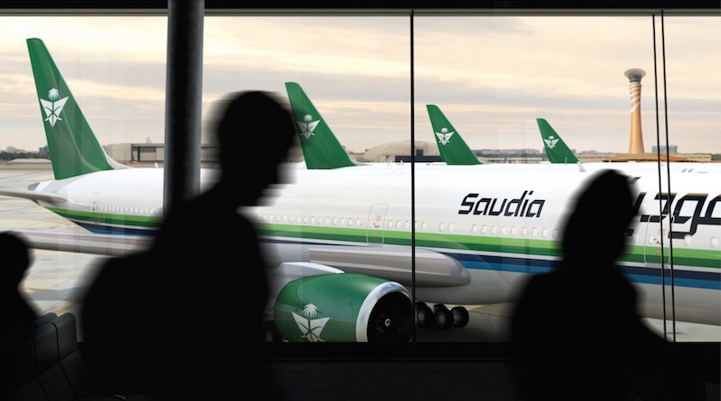
Saudia Airlines, the national flag carrier of Saudi Arabia, has undergone a rebrand to embody the country’s culture.
Saudia Airlines collaborated with Landor & Fitch to refresh the brand and created a new livery to propel it into a new era while celebrating Saudi culture. The update infused aspects of Saudi identity across the logo, color palette, illustration and patterns to ensure brand is synonymous with the Kingdom.
The rebrand breaks away from global airlines’ current brand practice, instead focusing on what makes Saudia Airlines unique as an airline – the Kingdom’s national identity. Leaning into Saudi’s personality, the rebrand has been positioned to celebrate Saudi culture and the role of the Airline as a national carrier. It has been designed to reinforce Saudia’s national identity through all five senses. Customers can expect an authentic Saudi experience throughout their journey, including a distinctive fragrance, sonic identity and locally inspired cuisine – all crafted to mirror Saudi Arabia’s welcoming spirit and hospitality.
The Saudi identity and culture have been encapsulated across all touchpoints of the customers’ experience with the brand. One significant aspect to the new brand is that it features three distinct colors, which represent key features of the Saudi identity.
- Green, to represent Saudi generosity and hospitality – a symbol of both national pride and the lush palm tree.
- Blue to symbolize Saudi seas and skies, representing the limitless nature of Saudi aspirations.
- And the sand color, inspired by Saudi’s desert dunes, to represent Saudi authenticity and its deep-rooted values.
Landor & Fitch undertook an extensive rebrand process during a widespread strategic and creative collaboration process. The key focus driving the creative process was to restore what is loved about the Saudia Airlines brand.
During the process, Saudia Airlines celebrated its 75th anniversary and commemorated the occasion using its 1972 livery. This highlighted the brand as a national icon and point of pride in Saudia Arabia and provided inspiration for the new design. By looking at the company’s “best self”, the new brand used this nostalgia to take the best from the past whilst looking forward creating a clear purpose for the future.
The rebrand reignites core elements of Saudia Airline’s brand values whilst simultaneously aligning it to the company’s new values for today. Saudia Airline’s cross sword emblem has been redesigned to create a greater sense of openness and warmth in line with Saudi values.
The emblem is now designed as crossed arches to represent the crossroads of journey making. The design of the typology in the wordmark was inspired by Arabic calligraphy, evoking the Kingdom’s classic font while bringing it into a modern world. Dynamic new patterns have been designed to represent the essence of the Kingdom – these include landscape, culture and generosity.
The new Arabic typeface was created at Tarek Atrissi Design specifically for Saudia. The new font, exclusively designed for Saudia, is the Arabic counterpart of a special cut of Latin font Bw Gradual-called “Saudia Sans”- and is available in seven weights. It is used in all Saudia printed and digital communication material, on the ground and in the sky.
Ryan Frost, Executive Creative Director, Landor & Fitch explains: “Saudia Airline’s rebrand centered around communicating the charm and personality of Saudi culture. These days too many brands are playing it safe, resulting in blandness in many sectors. This sense of sameness is prevalent across the aviation industry. The Saudia Airline rebrand tackles this by tapping into what makes the company unique – its connection to its culture. The rebrand elevates the warmth and hospitality of Saudi people to unlock a more emotionally engaging identity so the airline stands out against global competitors.”
Khaled Tash, Group Chief Marketing Officer, Saudia Group comments: “Saudia Airlines is the most iconic brand in Saudi. When we ask our customers how they feel flying with Saudia Airlines, the response is often that it feels like home. Through this rebrand we have decided to strengthen our national identity and play into what makes us different to our competitors – our culture. Our name and logo are an integral part of the Kingdom’s aviation history and development. It was therefore important that we play into the emotional connection Saudis have with these elements of our brand and restore them to suit today’s world. We have incorporated this rich heritage into our new identity that reflect our visionary approach, poised to captivate the world.”
The redesign will be implemented across the Saudia Group including the rebrand of all the group subsidiary companies, critically for the airline, the design of cabins, regeneration of lounges, office spaces, uniform design, onboard interfaces, website, app and all key customer touchpoints at launch.